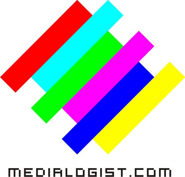
This work is a simple animation that I made in Adobe Animate and Flash to represent my consulting company logo.
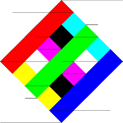
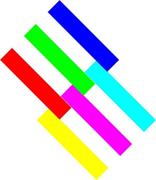
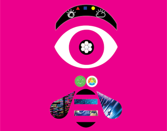
The design concept of the logo is showing the letter M & E (which are the two first letters of ''Medialogist'') with the primary colours of broadcasting and print media. RGB & CMY+Black as background.
As the slogan, I choose #WeViewMore to represent co-creation philosophy in Design Thinking Method that I always approach in different projects.
We refer to me as the designer and the customers (sponsor users) as a team to co-create a win-win innovation after viewing and understanding the root of problem/challenge in any project.
Besides the three dots after We View More are a symbol of the RCA connector, or a phono connector or (in other languages) Cinch connector, which is a type of electrical connector commonly used to carry audio and video signals.
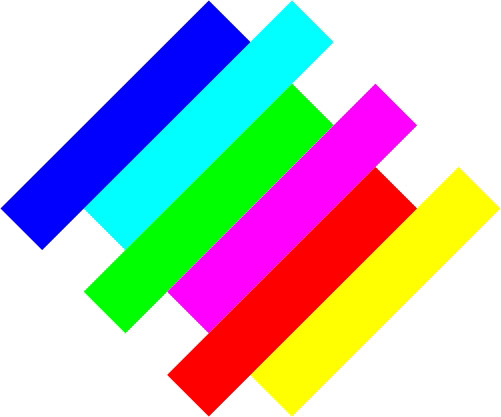